

TL;DR
Office portrait displays look most professional when frames, backgrounds, crops, and print finishes are chosen as one visual system. Use neutral backgrounds, consistent head sizes, simple frame materials, and glare-controlled finishes for reception walls, leadership galleries, and consultant offices.
A wall of portraits can make a workplace feel credible in seconds, but mismatched crops, glossy glare, and random frame colors can make the same wall feel improvised. The best approach to photo frames and background choices for office portrait displays treats every image as part of a brand system, not a separate decoration. For teams refreshing headshots before printing, Looktara helps create polished professional imagery that can translate well from LinkedIn profiles to office walls.
Table of Contents
What makes an office portrait display look professional?
An office portrait display looks professional when every portrait shares a consistent crop, background tone, frame style, mat width, and print finish. The goal is visual order: faces should feel equal in scale, frames should match the room, and the display should support the organization's brand without competing with signage or interior design.
Office portrait display: a coordinated wall, shelf, board, or digital presentation of employee, founder, partner, or leadership portraits in a workplace.
A strong display sends a simple message: the people behind the business are visible and credible. Research on visual media and emotion, including a 2023 overview in Proceedings of the IEEE, examined how images can affect perception and emotional response, which supports careful choices around tone, expression, and visual consistency in professional settings (Wang, Zhao, and Wu, 2023).
Key insight: portrait displays work best when the viewer notices the people first, then the brand, and only last the frames.
Common office formats include leadership walls, reception-area staff grids, hallway gallery walls, and client-facing consultant boards. A digital version can also work in modern lobbies; a digital photo frame is a frame that displays digital photos without requiring a computer or printer, according to the Wikipedia definition supplied in the research data.
Core elements that must stay consistent
- Crop: keep head size, shoulder line, and eye level consistent across all portraits.
- Background: choose one shared background family, such as warm gray, white, charcoal, soft beige, or branded color.
- Frame: repeat the same material and profile, unless a gallery wall intentionally separates teams or roles.
- Finish: use the same paper surface across the wall to control glare and color variation.
- Spacing: align frames to a measured grid instead of estimating by eye.
Consistency matters more than expensive materials. A modest black metal frame with a matte print can look more refined than premium frames used without a layout plan.
Which photo frames work best for office portraits?
The best office portrait frames are simple, durable, and visually quiet: black metal, natural wood, walnut, white wood, and brushed silver are usually safer than ornate, oversized, or highly decorative styles. Frame choice should match the room's architecture, furniture finish, and brand personality before matching individual taste.
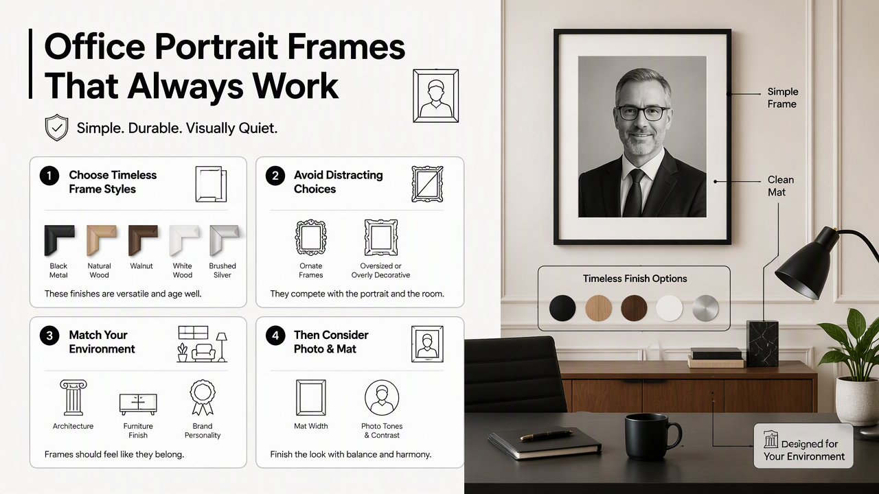
Black frames suit law firms, finance offices, agencies, and monochrome interiors. Natural wood suits wellness practices, coaching studios, hospitality brands, and small businesses that want warmth. Silver or aluminum suits tech offices, clinics, and modern coworking spaces. White frames suit bright studios, creative offices, and Scandinavian interiors.
Grand Frame's 2026 article on custom framing notes that aluminum, glass, and smooth wood finishes are popular for modern interiors because they complement contemporary spaces (Grand Frame, 2026). That guidance fits portrait walls, where the frame should support the person rather than dominate the display.
Frame materials compared for office portrait walls
| Frame material | Best office use | Visual effect | Watch for |
|---|---|---|---|
| Black metal | Leadership walls, law, finance, consulting | Crisp, formal, structured | Can feel harsh with very pale backgrounds |
| Natural wood | Wellness, education, coaching, hospitality | Warm, approachable, human | Wood tones must match furniture |
| Walnut | Executive suites, boardrooms, premium services | Established, refined, traditional | Dark walls may need lighter mats |
| White wood | Studios, design firms, bright reception areas | Clean, airy, modern | Shows marks faster in high-traffic areas |
| Brushed silver | Tech, healthcare, laboratories, coworking | Precise, neutral, contemporary | Can reflect too much light |
A frame width of 0.75 to 1.5 inches usually works for standard office portraits. Wider frames can suit executive portraits, but repeated heavy frames may make a staff wall feel crowded.
Recommended portrait sizes by office location
- Reception wall: 11 x 14 inches or 16 x 20 inches, depending on viewing distance.
- Hallway staff grid: 8 x 10 inches or 11 x 14 inches for clean repetition.
- Executive office: 16 x 20 inches or 20 x 24 inches for a single founder or partner portrait.
- Conference room gallery: 12 x 16 inches or 16 x 20 inches with generous spacing.
- Desk or shelf display: 5 x 7 inches or 8 x 10 inches in a weighted tabletop frame.
A useful rule: larger rooms need larger portraits, but bigger prints also expose inconsistent retouching, soft focus, and background flaws.
How should backgrounds be chosen for office portrait displays?
Office portrait backgrounds should be selected for brand fit, skin-tone compatibility, print reliability, and long-term consistency. Neutral gray, warm white, soft beige, and muted brand colors usually print better than busy office scenes, high-saturation colors, or backgrounds that change from person to person.
Backgrounds carry emotional signals. A white background feels clean and direct. Gray feels balanced and professional. Beige feels warm and personal. Dark charcoal feels premium and serious. A muted brand color can work when the brand palette is stable and the same color is used across every portrait.
The Looktara platform can help teams create headshots with consistent backgrounds before printing, which is useful when portraits are gathered from remote staff, freelancers, or multi-location offices. A consistent digital source file makes physical framing easier because the wall no longer has to hide major differences between images.
Key insight: a portrait background should reduce visual noise, not prove that the photo was taken inside an office.
Background color guide for brand alignment
| Background choice | Best fit | Display effect | Print note |
|---|---|---|---|
| Warm white | Medical, coaching, real estate, service firms | Clean and friendly | Needs soft lighting to avoid flat faces |
| Cool gray | Consulting, finance, SaaS, legal | Balanced and neutral | Very reliable across frames |
| Soft beige | Wellness, education, hospitality | Human and approachable | Works well with wood frames |
| Charcoal | Executive, luxury, creative leadership | Strong and premium | Needs careful contrast for dark clothing |
| Muted brand color | Agencies, startups, personal brands | Distinct and memorable | Must be tested before bulk printing |
Backgrounds should also work with clothing guidance. Navy, charcoal, cream, black, and muted jewel tones usually sit well against neutral walls. Fine stripes and tiny patterns can create visual distraction, especially when portraits are printed small.
Crop rules for a clean staff grid
- Keep eyes at the same height across all portraits.
- Use the same crop ratio, such as 4:5, 5:7, or 8:10.
- Leave consistent space above the head.
- Keep shoulders visible unless the display is intentionally head-only.
- Avoid mixing seated, standing, full-body, and close-up crops in one grid.
- Use the same retouching level across the team.
For creator-led businesses and fitness professionals, brand photos sometimes need to work in both physical displays and online campaigns. In that case, product and promotional images can be planned alongside portraits using tools such as a fitness Instagram product photo AI generator, while the portrait wall stays clean and people-focused.
What print finishes and layouts prevent a messy display?
Matte or luster print finishes usually prevent messy office displays because they reduce glare, fingerprints, and reflections under ceiling lights. Layout quality depends on measured spacing, matching frame orientation, equal visual weight, and a clear hierarchy between staff portraits, leadership portraits, and brand signage.
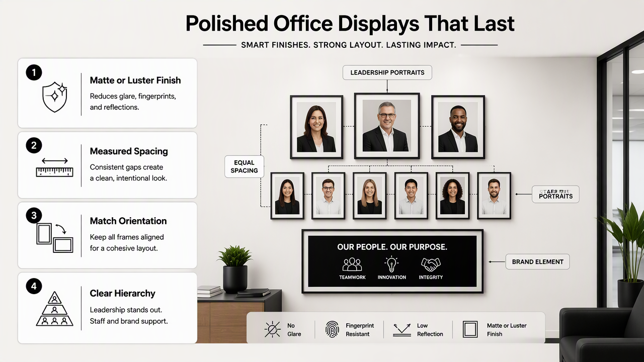
Glossy prints can look sharp in albums, but office lighting often creates reflections across glass. Luster, satin, or matte finishes are safer for reception areas and corridors. Acrylic and glass can look premium, but anti-reflective glazing matters in spaces with bright windows or overhead LEDs.
Acrylic face-mounts and frameless prints can suit modern offices, though they need careful alignment and professional installation. Traditional frames with mats are more forgiving when staff photos are replaced often.
Digital displays also deserve attention. Research on Project Starline in ACM Transactions on Graphics explored advanced video communication and realistic presence, showing how rapidly professional visual presentation is moving beyond static images (Lawrence, Goldman, and Achar, 2021). For most offices, framed prints still feel more permanent, while screens suit rotating teams or event spaces.
Simple layout options for different teams
| Layout type | Best for | How to keep it polished |
|---|---|---|
| Equal grid | Staff directories, clinics, real estate teams | Same size, same spacing, alphabetical or departmental order |
| Leadership row | Partners, founders, executives | Larger frames, centered placement, extra breathing room |
| Mixed gallery | Creative firms, boutique agencies | Repeat one frame color and one background family |
| Nameplate board | Fire, police, schools, departments | Modular slots for easy updates |
| Digital frame wall | Fast-changing teams, events, coworking | Use one portrait template and controlled slide timing |
SchoolPride's corporate employee photo board category shows how modular staff boards are used by businesses, fire departments, and police departments for organized employee presentation (SchoolPride). The same principle applies to framed walls: future updates should be planned before the first nail goes into the wall.
Installation checklist before printing
- Measure the wall and mark the centerline.
- Decide whether the display grows horizontally, vertically, or by department.
- Confirm final print size before buying frames.
- Print one test portrait and review it under office lighting.
- Check skin tones, background color, and glare from common viewing angles.
- Label the back of each frame for easy replacement.
- Keep an export template for future employee portraits.
A practical gallery wall needs a maintenance plan. Staff changes, promotions, and rebrands happen, so one spare frame size and one saved background recipe can prevent an uneven wall later.
FAQ about office portrait frames and backgrounds
Office portrait frame and background decisions are easier when the display is treated as a repeatable template. The answers below cover the common choices that affect how polished a wall looks after printing, hanging, and future staff updates.
What is the safest background color for office portraits?
Neutral gray is often the safest background color for office portraits because it works with many skin tones, clothing colors, frame materials, and wall colors. Warm white and beige can also work well, especially for friendly service brands. Strong brand colors should be tested before printing a full team wall.
Should office portraits use mats inside the frame?
Mats are a good choice when the office wants a classic, gallery-like look or expects to replace photos over time. A white or off-white mat creates breathing room around each face and helps smaller portraits feel more substantial. Mat width should stay consistent across the entire display.
Are digital photo frames professional enough for reception areas?
Digital photo frames can look professional in reception areas when the images share the same crop, color treatment, and slide template. They work best for rotating teams, events, awards, or multi-location companies. Static framed prints still feel more permanent for leadership walls and formal staff galleries.
How often should office portrait displays be updated?
Office portrait displays should be reviewed at least once a year, or whenever staff changes make the wall feel inaccurate. Fast-growing companies may need quarterly updates. Keeping a consistent export template, frame size, and background style makes updates faster and keeps older and newer portraits from clashing.
Conclusion
The best photo frames and background choices for office portrait displays come from one clear standard: consistent portraits, calm backgrounds, simple frames, glare-safe finishes, and measured spacing. Business owners, consultants, and creative teams should start with one test print, review it under real office lighting, then scale the same choices across the full wall. For new headshots that need to look consistent before framing, Looktara can help create polished images for professional profiles and office displays. Visit looktara.com to plan updated portraits before ordering prints, frames, or a full reception-area gallery.
Generated by EarlySEO.com